Your Complete Guide To Logo File Types

Having a strong visual brand is one of the key pieces of starting a new business, but what happens after that? What do you do with all of those different logo file types that your designer sends you? Should you use RGB or CMYK? What the heck is a PNG?
These are questions that most people have to ask when they receive their logo or branding package from a designer, so in this post I am going to answer all of your questions about logo file types and color profiles!
Logo File Types — Vector vs. Raster Files
Whether you’re designing your logo yourself, purchasing a pre-made logo, or hiring a designer for a custom logo design, it is vital that you receive/create the proper file types. Below is a summary of the different types of logo files you should be receiving from your designer as well as some notes on when to use each one.
Use Vector Files For Print
Vector files are unique because they are built from mathematically precise points which means they can be scaled to any size without losing quality. Vector files are what you will need in order to get your logo professionally printed on a poster, t-shirt, mug, etc. and what you’ll need to send a designer if you need them to make any updates to your logo.
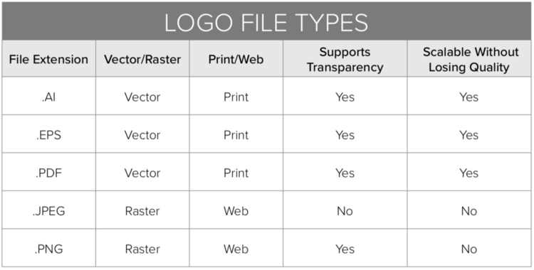
AI – Adobe Illustrator: This is the original, editable, working file that your designer used to create your logo. You will need Adobe Illustrator to edit this file.
EPS – Encapsulated PostScript: EPS files work exactly like AI files, but can be opened using programs other than Adobe Illustrator, such as CorelDraw, QuarkXPress, Photoshop, and even Microsoft Word and Powerpoint.
PDF – Portable Document Format: PDF files are the most common among designers and non-designers because they can be viewed and used on any computer using a myriad of programs. It is also possible for designers to preserve illustrator-editing capabilities, so that your logo can be opened and modified later just like an AI file.
Use Raster Files For Web
Raster files are built from tiny squares of color called pixels. Pixels cannot be added/removed with scaling. This means that as you scale the image up, you will likely see some blurriness called pixelization. Raster files are intended primarily for computer use and should not be used for printing unless absolutely necessary.
JPEG – Joint Photographic Experts Group: JPEGs are the most common file format for images and logos across the board. They provide great compression without decreasing the quality of the image which allows them to load quickly online while still looking crisp and clear. JPEGS do NOT support transparency, and will always show up with a white or colored background.
PNG – Portable Network Graphics: PNGs generally function the same way that JPEGs do, but with one important difference – they support transparency. If you want to use your logo on a colored/patterned background or image, this is the file you’ll want to use.
Logo Color Profiles — CMYK vs. RGB vs. Pantone
When you receive your logo files (or create them yourself) it’s important that you have color formats for both print and web use. I do NOT recommend using the same files for both, as you will notice a pretty drastic color difference from print to web by using the same file, which degrades the integrity of your brand and just doesn’t look very professional. Below I will explain the differences between CMYK, Pantone, and RGB files as well as when to use each one.
CMYK: This is the standard for four-color offset printing and digital printing. CMYK file formats use a combination cyan, magenta, yellow, and black ink to create the desired color. CMYK printing can run into issues because four different inks are being used, and depending on the printer, computer screen, and user, may come out slightly different each time. This is generally only noticeable to trained professionals, and not something you should worry too much about. As a rule of thumb, always use CMYK files for printing.
Pantone (PMS): Pantone is a color matching system that is used and understood by designers and printers across the globe. Unlike CMYK printing which can have slight color variances as mentioned above, Pantone uses one single ink, which means that the colors will match exactly every single time. It is because of this that Pantone is the industry standard for color matching, but also more expensive than CMYK printing.
RGB: RGB stands for Red, Green, and Blue. These are the colors that your eye sees when you look at anything on a computer screen. Digital images are made up of different combinations of red, green, and blue light projected by your computer, television, or phone screen to create the desired hue. RGB files should only be used online, and if printed may not appear to be the correct color.
Note: Hex (or hexadecimal) codes are frequently used for web use as well — these look like #F53D2B. There is no informational difference between RGB and HEX colors. They are just different ways of communicating the same thing.
That’s A Wrap!
You should now have a good understanding of what file formats to create when designing your logo, and what you should expect to receive from your designer and how to use each one.
If you’d like some hands on support from a professional brand designer, check out The Six Figure Brand Society! And if you’d like to just pass of the task of logo design all together, Team Specht & Co. can help with that too!