The Ultimate Guide To Logos
Do you know you need a logo, but you’re not sure where to begin? Maybe you’re looking to DIY your logo but are having trouble getting started, maybe you’re ready to hire a designer but have no idea how to tell them what you want, or maybe you just got a new logo that you love and now you have a million different logo files and don’t know how to use them.
These are struggles that almost every small business owner runs into during the branding process, whether they’re brand new biz owners or seasoned entrepreneurial veterans. Trust me, you are not alone.
I’ve written this post to help you weed through the tangled forest of logo design jargon and teach you everything you need to know about the four different types of logos, what file formats you need (and how to use them), and what the heck the difference between CMYK and RGB colors is!
This post is your one-stop shop for everything you need to know in order to make sure your logo is working for you instead of leaving you (and your customers) frustrated and confused.
Anatomy of a Logo
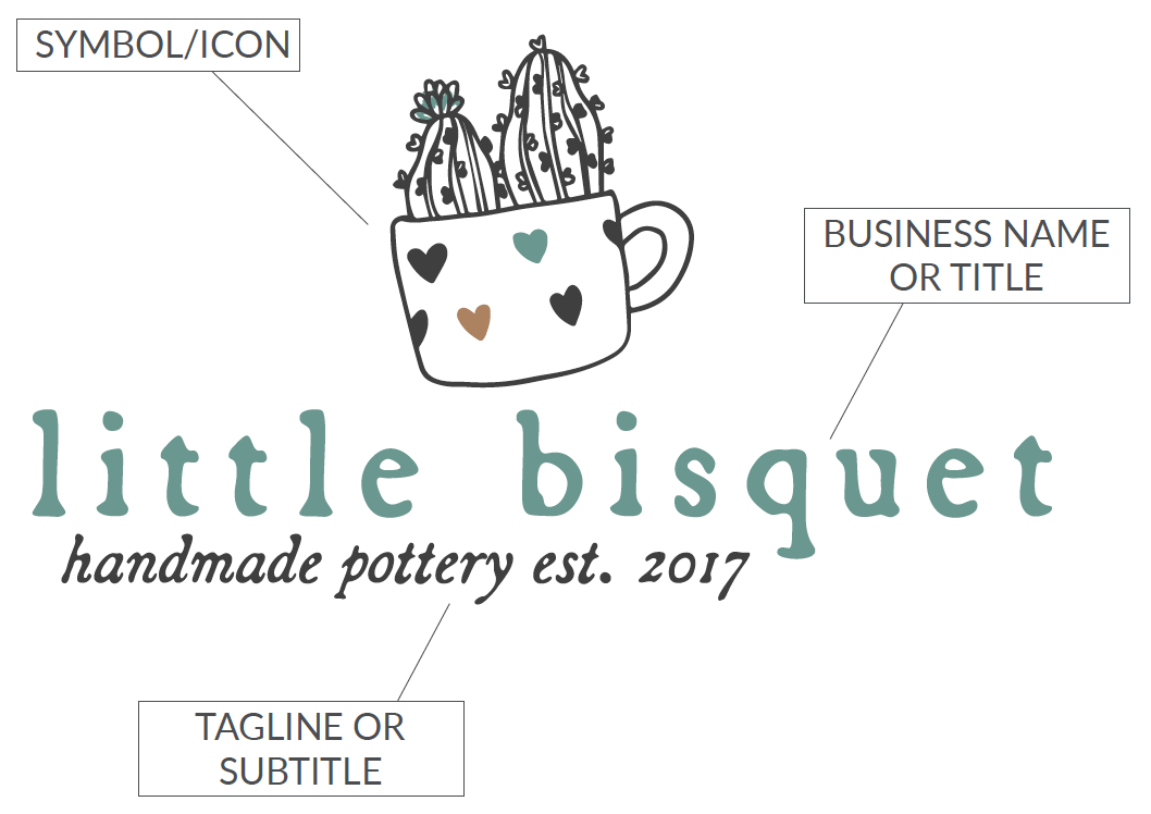
One of the most frustrating parts of designing a logo or working with a designer is often not knowing how to articulate what you want. This infographic is meant to help you identify all of the parts and pieces of a logo, so that you can begin to understand some of the crazy designer jargon and get clear on what you want your logo to look like.
Four Types Of Logos
One of the first steps in designing a logo is choosing which type of logo you’d like to use. There are four main types of logos to choose from: Lettermarks, Wordmarks, Pictorial Marks, and Combination logos. Below I’ll explain a little about what each one is, and when/where they’re best used.
1. Lettermark

A lettermark (sometimes called a monogram) is a typography-based logo that usually includes an acronym or abbreviation such as the companies initials. Lettermarks are kept simple while still remaining recognizable by utilizing just a few letters to identify a company. Lettermarks are very effective for businesses with long or hard to spell/ pronounce names.
Since lettermarks are entirely typography-based, it is important to choose a font and color palette that represents your business well, is legible at all sizes, and will not become outdated quickly. If your business is not extremely well-known yet, you can also add the full business name in a smaller font below the lettermark for added recognition.
2. Wordmark

Wordmarks are also typography-based logos, but instead of using an acronym or abbreviation, they use the entire company name. Wordmarks are especially useful for businesses who have a distinct and relatively short name such as Coca-Cola, Google, or Disney.
Since wordmarks, like lettermarks, are typography-based, it is important to choose a font and color palette that represents your business well, is legible at all sizes, and will not become outdated quickly.
3. Pictoral Mark / Symbol

Pictorial marks are entirely image based. They do not include any text and therefore are generally best used for very established brands like Apple, Target, or Twitter. Pictorial marks must be extremely unique in order to avoid confusion with other brands, and great care must be taken to consider their longevity, possible misinterpretations, and how well they identify the company.
Pictorial marks are generally only effective if you already have an established brand, but can be used as a complimentary logo for brands of all sizes who also utilize a lettermark, wordmark, or combination logo.
4. Combination Logo
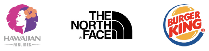
Combination logos are the most common and generally most effective type of logo for a majority of businesses. They combine elements of wordmark or lettermark logos with a pictorial element such as a symbol, graphic, or mascot to form a complete logo.
A major benefit to combination logos is that it causes customers to start associating a particular image with your brand right away. This increased level of brand recognition can allow you to move toward a pictorial or symbol logo in the future, if desired. Combination logos are also some of the easiest to trademark, as they’re generally very unique and distinctive.
Logo File Types
Whether you’re designing your logo yourself, purchasing a pre-made logo, or hiring a designer for a custom logo design, it is vital that you receive the proper file types. Below is a summary of the different types of logo files you should be receiving from your designer as well as some notes on when to use each one.
Vector Files
Vector files are unique because they are built from mathematically precise points which means they can be scaled to any size without losing quality. Vector files are what you will need in order to get your logo professionally printed on a poster, t-shirt, mug, etc. and what you’ll need to send a designer if you need them to make any updates to your logo.
.AI - Adobe Illustrator: This is the original, editable, working file that your designer used to create your logo. You will need Adobe Illustrator to edit this file.
.EPS - Encapsulated Post Script: EPS files work exactly like AI files, but can be opened using programs other than Adobe Illustrator, such as CorelDraw, QuarkXPress, Photoshop, and even Microsoft Word and Powerpoint.
.PDF - Portable Document Format: PDF files are the most common among designers and non-designers because they can be viewed and used on any computer using a myriad of programs. It is also possible for designers to preserve illustrator-editing capabilities, so that your logo can be opened and modified later just like an AI file.
Raster Files
Raster files are built from tiny squares of color called pixels. Pixels cannot be added/removed with scaling. This means that as you scale the image up, you will likely see some blurriness called pixelization. Raster files are intended primarily for computer use and should not be used for printing unless absolutely necessary.
.JPEG - Joint Photographic Experts Group: JPEGs are the most common file format for images and logos across the board. They provide great compression without decreasing the quality of the image which allows them to load quickly online while still looking crisp and clear. JPEGS do NOT support transparency, and will always show up with a white or colored background.
.PNG - Portable Network Graphics: PNGs generally function the same way that JPEGs do, but with one important difference - they support transparency. If you want to use your logo on a colored/patterned background or image, this is the file you’ll want to use.

Logo Color Profiles
When you receive your logo files (or create them yourself) it’s important that you have color formats for both print and web use. I do NOT recommend using the same files for both, as you will notice a pretty drastic color difference from print to web by using the same file, which degrades the integrity of your brand and just doesn’t look very professional. Below I will explain the differences between CMYK, Pantone, and RGB files as well as when to use each one.

CYMK
This is the standard for four-color offset printing and digital printing. CMYK file formats use a combination cyan, magenta, yellow, and black ink to create the desired color. CMYK printing can run into issues because four different inks are being used, and depending on the printer, computer screen, and user, may come out slightly different each time. This is generally only noticeable to trained professionals, and not something you should worry too much about. As a rule of thumb, always use CMYK files for printing.

Pantone ®
Pantone is a color matching system that is used and understood by designers and printers across the globe. Unlike CMYK printing which can have slight color variances as mentioned above, Pantone uses one single ink, which means that the colors will match exactly every single time. It is because of this that Pantone is the industry standard for color matching, but also more expensive than CMYK printing.

RGB
RGB stands for Red, Green, and Blue. These are the colors that your eye sees when you look at anything on a computer screen. Digital images are made up of different combinations of red, green, and blue light projected by your computer, television, or phone screen to create the desired hue. RGB files should only be used online, and if printed may not appear to be the correct color.
Using Your Logo: Do’s & Don’ts
So you’ve got your logo designed, and have all the necessary file types and color versions in hand. Now what? Well now you get to start using your beautiful new logo! Below are a few logo usage do’s and don’ts to ensure that you’re putting your brand’s best foot forward.
DO . . .
Use your logo on any/all materials related to your business
Give your logo plenty of breathing room (white space)
Use alternate versions of your logo when necessary
Share your logo with any businesses that you partner with when necessary
Ask your designer to make updates to your logo when necessary
DON’T. . .
Disproportionately scale your logo (don’t squish it!)
Add/remove elements from your logo
Cut off edges of your logo
Make your logo too small so that it is unreadable
Apply any special effects to your logo
Place your logo on top of busy photographs or patterns
That’s a Wrap!
You should now be able to comfortably identify which type of logo you have or want, know what file formats to create or request from your designer, and know when to use CMYK and when to use RGB colors, and have a basic idea of how to best use your logo in order to maintain the integrity of your brand.
Feeling more overwhelmed than when you started?
If you’re feeling like you’re in little over your head with this whole logo design thing, maybe it’s time to hand the reins over to a pro! Book a call with me so we can discuss what logo or branding package will best meet your needs and budget!