A Beginners Guide To Color Theory
Believe it or not, there is a pretty precise science used to figure out what colors best represent your brand. Color theory explains how humans interact with color, how colors mix, match or clash, and the subliminal messages that colors communicate.
Understanding color theory will help you to elicit the reaction you want from your audience and help you understand why some color combinations work and others. . . not so much.
In this post, I’m giving you a quick peek into the world of color theory, and equip you with some tools and knowledge to select your brand colors strategically.
Color Theory for Beginners: The Color Wheel
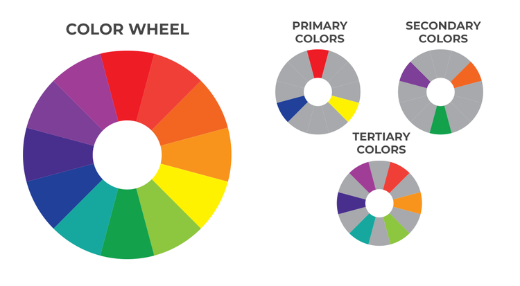
Sir Isaac Newton developed the color wheel in 1666, and it’s been used by designers and artists around the world since then to develop color schemes, mixing methods, and more.
The color wheel include three primary colors (red, yellow, blue), three secondary colors which are created when primary colors are mixed (green, orange, purple) and six tertiary colors which are created when a primary color is mixed with a secondary color (such as blue-green, red-violet, yellow-orange).

Warm Vs. Cool Colors
You will often hear designers refer to a particular color as warm or cool, and for good reason too! Warm colors (red, orange, yellow) are usually grouped to one side of the color wheel, with cool colors (green, blue, violet) on the opposite side.

Warm Colors
You will often hear designers refer to a particular color as warm or cool, and for good reason too! Warm colors (red, orange, yellow) are usually grouped to one side of the color wheel, with cool colors (green, blue, violet) on the opposite side.
Cool Colors
Cool colors tend to evoke a calm, relaxed, or stable feeling in viewers. When used alone, however, these colors can sometimes have a cold or impersonal feel. When choosing cool colors, mix in a warm or neutral color to soften things up a bit and make your color palette feel a little more personable and welcoming.
Neutral Colors
Neutral colors are great to mix with cool or warm color palettes. They are useful for backgrounds in design and tend to tone down the use of other bolder colors.
Recognizing colors and warm and cool can help you to understand how choose colors that accurately represent your business, and how to create a balanced color palette that you love!
Color Theory for Beginners: Color Schemes
Using the color wheel along with a base knowledge of warm vs cool colors, and the emotions associated with each, you can now begin creating your brand color scheme (or palette). There are a variety of types of color schemes that use the color wheel to determine which colors work well together.
Complementary: 2 colors | Opposite
Complementary colors should be used as main and accent colors. They are located opposite of each other on the color wheel.

Analogous: 3 colors | side by side
Analogous colors share the same undertones, and are found next to each other on a color wheel.

Triad: 3 colors | equally spaced around the color wheel
Triads are used to create a dynamic color scheme. They are formulated by picking three colors that are evenly spaced around the color wheel.

Split-Complementary Triad: 3 colors | 2 opposite + 1 adjacent
Split-complement triads create a more muted color combination. These are created by choosing two colors opposite each-other on the color wheel, and then choosing a third color that is adjacent to one of the first two.

Resources For Choosing A Color Palette
If you’re feeling a little overwhelmed about choosing your brand colors, don’t worry! You are totally not alone, and nothing has to be set in stone today. By now you should have a good understanding of what colors evoke certain emotions, as well as some basic methods for choosing colors that work well together.
There are also several great online resources that you can use to test out different color combinations, and some that will even suggest colors for you!
Adobe Color allows you to choose from several different color rules including the ones discussed in this workbook, and then lets you choose one color you like while suggesting complementary colors that match your chosen rule.
Coolors.co is a color palette generator that allows you to see how colors look together. You can either have the generator randomly create a color palette for you, or you can select a few colors you know you like, lock them in your color palette, and then randomly generate additional colors until you find something you like.
Paletton works almost exactly like Adobe Color, allowing you to choose from multiple color rules, and then and then generating colors that follow that rule based on one color of your choice.
I encourage you to play around with the tools listed above to figure out what works best for you. Pinterest is also a great place to search for color palette inspiration!

Choose Colors with Confidence!
Get 50+ Designer Approved Color Palettes for Your Brand
Struggling to choose the perfect brand colors?
Get inspired with 50+ expertly crafted palettes in this free Canva doc!